Approaches to organizing Figma files at SpatialChat
SpatialChat is the online workspace for remote teams for collaboration and other working activities. We solve a colossal number of use-cases as work meetings with colleagues, townhalls for several departments, brainstorm sessions, and corporate parties. We started as a small startup with few people on a team almost three years ago and now we are the same startup but with 50 brilliant teammates located around the world who work together to improve SpatialChat and provide the best experience for remote teams.
Also, we have five designers on our team with different spheres of expertise but all of us are passionate about what we do. Especially, if it could bring our teammates and us more comfortable workspaces.
In this article, we will cover:
• Teams
• Projects
• Files
• Pages
Our goals and audience
Except SpatialChat, the most popular workspace for our team is Figma. We built there plenty of sources of truth for developers, QA engineers, managers, analysts, and designers. We don’t have any customers who ask for sharing mockups or order some special screens, as a result, we could make Figma’s files system that is comfortable for our team. This files system is our small product inside our lovely SpatialChat. Therefore, it was impossible to ignore the pain points that our colleagues had when opening our Figma’s files at least once. As a result, we did research to find the pain points of our team and set goals based on them.
Our files system on Figma must be:
Easy to maintain.
Everyone on our team has a lack of time because we are working for a startup, so it is a cardinal sin to waste a lot of working hours on anything.
Easy to understand.
If the file system is not self-explanatory, no one will use it or they will use it wrong. If it needs to describe how to find some files or documents there, is it a good system?
Easy to handoff.
This is the most valuable point that influences designers and developers a lot and takes much effort from both sides.
Easy to navigate.
Any of our teammates should be able to navigate through the different projects, files, and pages without any assistance.
So we have started organizing our files system on Figma in a way that would be crystal clear and comfortable to use for all our teammates.
Teams
Figma Teams can actually be a great way to separate teammates into individual small parts of the product within your organization structure.
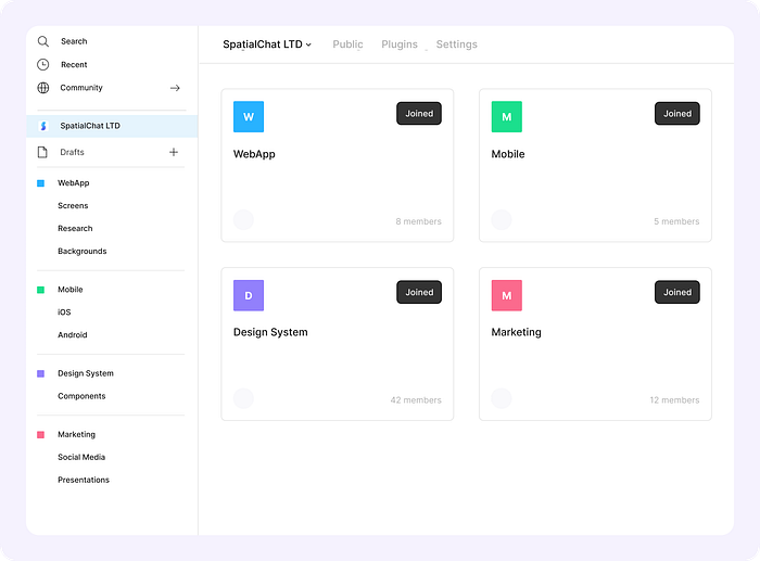
As I already mentioned, we have only one digital product and a quite small design team, so we use only one Team that solves all our requests. Then we divided all files that we have into a few projects.
While dividing, we chose the easiest way to do this. Starting from the top, due to the small product and a simple team organization structure, we put all styles and components in one Project. Since we are using them universally across all files of Figma Team. After a few attempts we have this structure:

Diving deeper into the reason why we did this structure, we had the Design System with components that could cover all platforms, such as Web/iOS/Android. Also, some parts of our Design system successfully solve all needs of the Marketing team. Impossible not to mention, that we have a file with Backgrounds that is a unique part of the spaces that have a lot of positive feedback. I suppose, there is no need to explain parts with Research, Knowledge, and Legacy because their names speak for themselves.
While building this file system, we looked further and got ready for the team scaling and fast product growth.
Consequently, our in-between version of Figma’s file structure with separation into different Teams will probably look like this:

Figma Team is an amazing tool that helps get all the benefits of isolated team structures and terminates the biggest concern that shows up in companies with much more tangled organization’s structure. This is a question: “Who’s working on what?”. The concern could be easily solved by the Member List on the Team Settings that appears if we will go along the isolated team’s way.
Regarding the vision of our perfect future structure with isolated teams, we expect to have something like this:
This approach, where our Design system is independent, helps us share the common source of truth with the entire company. Also, this structure of Teams could help localized team-specific libraries or local components based on Brand style, for instance, but could not be placed on the Design system or the other type of teams for some reason.
Actually, this is just the possible future that we expected for the next few years but everything may change and our structure would be different. This file system suits our team but there are a lot of other possible ways how to organize this system.
Projects
At present, our WebApp is our only product, therefore it’s relatively easier to keep everything under one project, including Marketing and work on the Landing page of the Product.
The most valuable Projects for our design team on Figma are WebApp and our Design System. In case of that, I would like to highlight these parts of the file structure.
Regarding our Design System structure, we chose a pretty common approach to build it. Each part of the Design System was divided into an independent file.
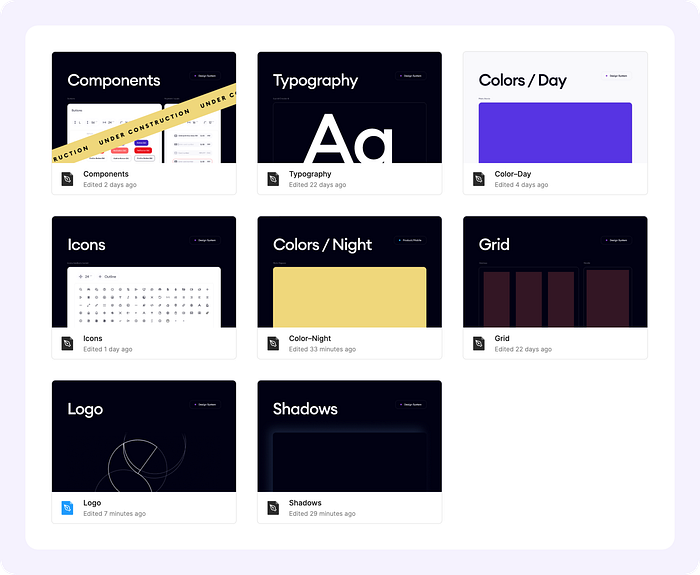
This method helps us to connect and disconnect each part of the Design System’s file without a flood of inconvenient libraries for specific tasks. Also, each of our Design System’s file was linked with each other. As a result, we may not connect Icon and Logo files for each file that we are working on because all icons and logos are already located on the Component’s file.
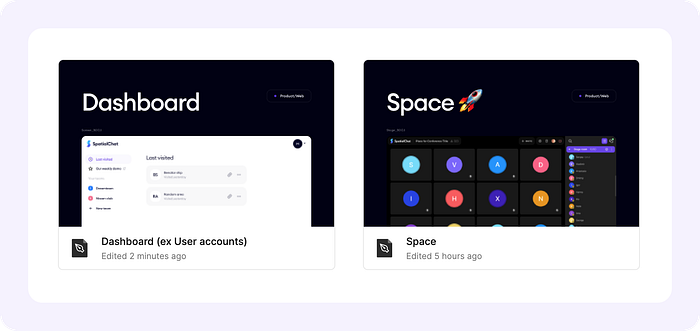
Regarding the main files with mockups of the interfaces of the platform, we have only two Files: Dashboard and Space right now. At this point, I suggest trying Spatial.chat to understand the motives of some approaches for the file structure.
We tried a few other approaches, like the only one file with all mockups or two files, where the first was for work with UX, concepts, and prototypes and the second one was for the final design of each mockup. Those attempts were inconvenient for our team and we gave them up.
The current approach with independent files for Dashboard’s and for Space’s mockups is justified by differences in components for each of these files. We decided to add only repetitive elements to our Design System and leave unique ones as local components for each Dashbord and Space file. It helps us to have local components that suit either Dashboard or Space without overloading our Design System.
Files
We do our best to improve our user’s experience and make their using of our platform easier, so we couldn’t help doing the same for each member of our team who opens our files with mockups.
As a result, for all of the files, we have a thumbnail to distinguish each file from the others visually.
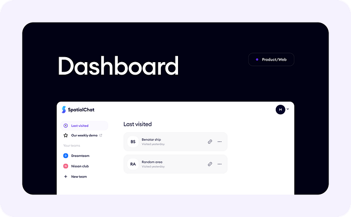
Each of our thumbnails has a name, a preview of the mockups inside, and the status. In the image below you may see examples of our statuses.
Also, we had a few experiments on our page’s structure inside of each file. We tried before to gather all flows on the only one page but the biggest disadvantage for us was the inconvenience when you need to add a few new mockups but you ran out of free space. In this case, we had to move everything around and sometimes we could lose something important by accident. So we gave up with that idea and tried a new one.
A new approach by separating all flows into independent pages was more convenient for us because it was easier to find the exact flow and we got more space for maneuvering with the mockups. Nevertheless, we faced the only one problem all the time.
This problem is handoff mockups to developers. Sometimes, even designers messed up with which of the flow was already on production or was handed off to developers. So we had to solve this problem, we did it, and now you can see what we have right now:

We have special pages called “Handoff 🟢 [task number]_[task name]” where we gather all mockups for developers to solve one of our tasks from the task tracker.
Then, we have pages with different flows that are separated into different sections, like “⬇️ Settings” which help us find the needed flow faster.
Also, we have pages called “Concept 🧠”. I guess that is obvious. These pages are only for concepts, ideas, or hypotheses that we made up.
The most valuable page for this File is “🦴 Local components” page. This page is only for components used in this File and couldn’t be used as the Design System’s components.
By using these types of pages, we finally solved the maximum number of issues and everything became more clear on our Files.
Pages
It is not a secret that every designer has a different style of placing mockups or comments for the mockups. This has also become an issue for our developers, that have to waste a lot of time understanding what they are looking at and the structure of the mockups.
We changed the structure of each page with the Flow, Concepts, or Handoff to solve such issues.
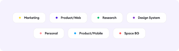
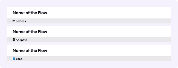
We added special components “Labels” with information containing the name of the Flow, the type of the elements of this Flow.
Sometimes, it is necessary to find a task for a Flow that was designed before to refresh our knowledge. A common issue for designers in a young startup is remembering the status of the Flow. We had to search on our task tracker but it also took some time. In case of that, we built small stickers that we could put near the Flow or some specific mockups to save the history of tasks, a status, and changes.
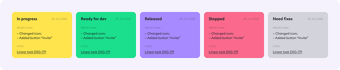
These stickers have a date that shows us the last change of the status, different types of statuses, comments for developers, and a link to a task. In the upcoming future, we are going to add the name of the designer who made the Flow and added changes.
On the real page with the Flow all these parts could look like in the image below:

The piece of wisdom is that the harder you make something, the less likely your team is up to do it. So we are trying not to overload our design team but solve existing problems.
Keeping our files and projects organized in Figma has been massively beneficial for us and has made the process of collaboration between teams much more efficient.
Closing thoughts
This enormous size of work helps us to reach all our goals and solve all problems that we set at the beginning of this article. Also, we had enough time to validate the fact that the current structure is much more suitable for our team, especially for developers.
All these actions are only the beginning of the way for our design team. More likely, we will face more challenges but, by using the superpower like being able to hear each other in the team, we will definitely solve everything.
I hope this article was useful and will help you visualize how to set up your files in Figma. Also, our team will get you the ability to sneak peek at our work’s process including using that File structure.
👇Here are our template for your copying pleasure:
Template
Let me know in the comments below how your team has set up your Figma files, and what’s worked well or not.
